Make Any Layout #3

I'm a Rajat Nai. An excellent academic record, ability to understand and good at Web-Dev and programming. Hard-working web developer with a flair for creating elegant solutions in the least amount of time. Passionate about learning new technology. Regular attendee of web developer meetups and hackathons.
After using basic CSS functionality to make the layout we transfer to FlexBox and it leads us to the last topic Grid.
So the first question in your mind is why we need a grid when we have flexbox and I am confident that I can make any layout with the flexbox then why should I learn grid? For answering that question just remember why you learn Flexbox, it's not because you can not create your desired layout through the basic CSS float, display, and position property but you learned because it makes your life easier. So developers invented Grid to make complex 2d layouts faster and easier.
Let's create below layout
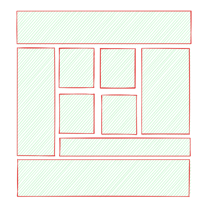
The upper layout is created in the https://excalidraw.com/ which I use to get a general Idea of my website layout.
<div class="container">
        <div class="header">header</div>
        <div class="navbar">navbar</div>
        <div class="p1">ads</div>
        <div class="p2">ads</div>
        <div class="article">1</div>
        <div class="article">2</div>
        <div class="article">3</div>
        <div class="article">4</div>
        <div class="footer">footer</div>
</div>
Let's write CSS for it
/* general css */
html,
body {
  margin: 30px;
  padding: 0;
}
.container > div {
  padding: 1rem;
  color: #fff;
  font-size: 1.5rem;
  font-weight: normal;
  border-radius: 5px;
  box-shadow: 0.5px 0.5px 5px #000;
}
/* make container div as grid */
.container {
  display: grid;
  grid-template-columns: 1fr;
  grid-template-rows: auto;
  grid-gap: 1.5rem;
  /*define grid areas*/
  grid-template-areas:
    "header"
    "navbar"
    "p1"
    "p2"
    "article"
    "article"
    "article"
    "article"
    "footer";
}
.header {
  /*give every class there respective are in grid */
  grid-area: header;
  background-color: hotpink;
}
.navbar {
  grid-area: navbar;
  background-color: dodgerblue;
}
.p1 {
  grid-area: p1;
  background-color: orangered;
}
.p2 {
  grid-area: p2;
  background-color: orchid;
}
.article {
  /* auto-flow FTW */
  background-color: olivedrab;
}
.footer {
  grid-area: footer;
  background-color: crimson;
}
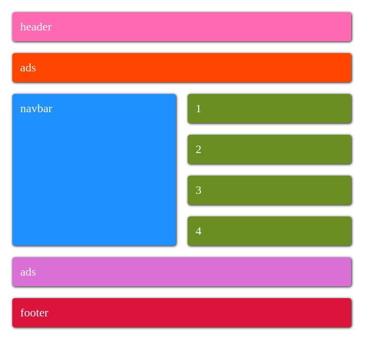
Now we make layouts for different screen sizes
@media (min-width: 544px) {
.container {
grid-template-columns: 1fr 1fr;
/*you can also write
grid-temlate-rows: auto auto .. auto 8 times
it have same meaning as below one as programmer we find
way to how minimize and simplify code */
grid-template-rows: repeat(8, auto);
grid-template-areas:
"header header"
"p1 p1"
"navbar article"
"navbar article"
"navbar article"
"navbar article"
"p2 p2"
"footer footer";
}
}
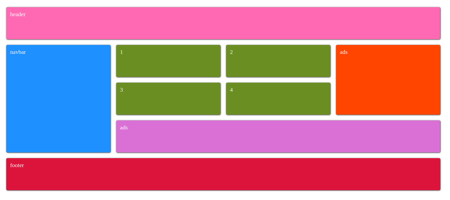
@media (min-width: 992px) {
.container {
grid-template-columns: 1fr 1fr 1fr 1fr;
grid-template-rows: auto auto auto auto auto;
grid-template-areas:
"header header header header"
"navbar article article p1"
"navbar article article p1"
"navbar p2 p2 p2"
"footer footer footer footer";
height: 80vh;
}
}
So, the question is when you should use FlexBox or Grid, In my case I use FlexBox when I have to align content in the 1d and use Grid when I have
content in which I have to place different places on the web page. But the most proper way which most developer use is to use both grid and flexbox, by your way you can figure out where should you need a grid and where flexbox or you need a grid in flexbox or flexbox in a grid.


