Make Any Layout #2

I'm a Rajat Nai. An excellent academic record, ability to understand and good at Web-Dev and programming. Hard-working web developer with a flair for creating elegant solutions in the least amount of time. Passionate about learning new technology. Regular attendee of web developer meetups and hackathons.
During the stone age of CSS, developers are creating website layouts using float, and positioning until the Flexbox arrived with its revolutionary power. It's too much dramatic intro, so now let's understand Flexbox in css.
Why it's important?
Making a layout using float and positioning is too damn hard and time-consuming, you have to maintain every box element manually and mistakes in any one of the elements can hold the power to mess with your whole website of yours.
Unlike the previous part in this, we try to build a layout using html and css flex properties.
Step - 1:
So let's start with writing HTML code. So for that, make the row as div and for every element make a div also.
 <div class="main-section">
        <div class="container nav-container">
            <div class="nav-item logo"></div>
            <div class="nav-item links"></div>
            <div class="nav-item links"></div>
            <div class="nav-item links"></div>
            <div class="nav-item links"></div>
        </div>
        <div class="container main-container">
            <div class="main-item">
                <div class="item-1"></div>
                <div class="item-1 item-1-top"></div>
            </div>
            <div class="main-item">
                <div class="item-2"></div>
            </div>
            <div class="main-item">
                <div class="item-3"></div>
                <div class="item-4">
                    <div class="item-1 item-1-top"></div>
                    <div class="item-1 item-1-top item-1-left"></div>
                </div>
            </div>
        </div>
        <div class="container bottom-container">
            <div class="bottom-item item-right"></div>
            <div class="bottom-item item-sides"></div>
            <div class="bottom-item item-sides"></div>
            <div class="bottom-item item-left"></div>
        </div>
    </div>
Step - 2:
Let's write common CSS.
body {
    margin: 40px 150px;
}

.container{
    width: 100%;
    display: flex;
    flex-direction: row;
    margin-top: 60px;
}
in the container class, we make the width 100% and make display flex which makes two imaginary access one main and the second cross, by only specifying flex row become main access and column become cross access. So, it makes all div children stack in the row direction.
Step - 3:
Let's start with nav-container
.nav-item {
    width: 100px;
    height: 20px;
    background-color: black;
    margin-left: 10px;
}

.nav-item {
    width: 100px;
    height: 20px;
    background-color: black;
    margin-left: 10px;
}

.logo{
    height: 40px;
    width: 40px;
    margin-left: 0;
    margin-right: auto;
}
Assign style to Logo.

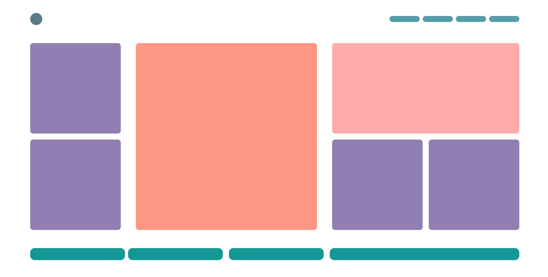
So, in this image we can see that logo and other link are not properly assign so lets make it.
.nav-container{
    align-items: center;
}

So, now let's give a style to it
.nav-container{
    align-items: center;
}

.nav-item {
    width: 100px;
    height: 20px;
    border-radius: 10px;
    background-color: #569DAA;
    margin-left: 10px;
}

.logo{
    height: 40px;
    width: 40px;
    border-radius: 100%;
    margin-left: 0;
    margin-right: auto;
    background-color: #577D86;
}

Step - 4:
Let's code the main section
.item-1{
    height: 300px;
    width: 300px;
    background-color: black;
}
.item-2 {
    height: 620px;
    width: 600px;
    background-color: black;
}

.item-3 {
    height: 300px;
    width: 620px;
    background-color: black;
}
Give size and colour to every block in the main section.
.main-item:nth-of-type(1) {
    display: flex;
    flex-direction: column;
    margin-right: auto;
}

.main-item:nth-of-type(3) {
    display: flex;
    flex-direction: column;
    margin-left: auto;
}

.item-4 {
    display: flex;
}
For the first and last div in the main container, assign the display as flex, assign flex-direction to the column so it stacks all elements on the column, and assign margin.
For class item-4 we assign display to flex so it set all children in a row stack.

So now assign margin to all div.
.item-1-top {
    margin-top: 20px;
}

.item-1-left{
    margin-left: 20px;
}
So, now let's give a style to it
.main-item:nth-of-type(1) {
    display: flex;
    flex-direction: column;
    margin-right: auto;
}

.main-item:nth-of-type(3) {
    display: flex;
    flex-direction: column;
    margin-left: auto;
}

.item-1{
    height: 300px;
    width: 300px;
    border-radius: 10px;
    background-color: #917FB3;
}

.item-1-top {
    margin-top: 20px;
}

.item-1-left{
    margin-left: 20px;
}

.item-2 {
    height: 620px;
    width: 600px;
    border-radius: 10px;
    background-color: #FA9884;
}

.item-3 {
    height: 300px;
    width: 620px;
    border-radius: 10px;
    background-color: #FFABAB;
}

.item-4 {
    display: flex;
}

Step - 5:
So let's style bottom-container
.bottom-item{
    height: 40px;
    width: 350px;
    background-color: black;
    flex: 1;
}
Give style to the bottom item and by giving flex value 1 it makes the item take all width of the parent container, by giving all elements to flex 1 all children take equal width in the container.

give margin and make space evenly between all element.
.bottom-container{
    justify-content: space-evenly;
}
.item.right {
    margin-right: 10px;
}

.item-sides {
    margin-left: 10px;
    margin-right: 10px;
}

.item-left {
    margin-left: 10px;
}

Give style to it :
.bottom-container{
    justify-content: space-evenly;
}

.bottom-item{
    height: 40px;
    width: 350px;
    background-color: #159895;
    border-radius: 15px;
    flex: 1;
}

.item.right {
    margin-right: 10px;
}

.item-sides {
    margin-left: 10px;
    margin-right: 10px;
}

.item-left {
    margin-left: 10px;
    flex: 2;
}

Modern websites, use Flexbox to make the layout of the website. So now we just remain we CSS grid which we learn in next part.


