Making a Layout for a website is a major task for front-end developers. The layout is crucial in web development, as it determines how the page elements are displayed on the screen. But major of beginner doesn’t know how to make a layout and how can create it using only CSS.
In this you will learn all ways to make a layout in CSS with code, you can practice this code on your machine. You just need VS code (any code editor), one index.html file and a second styles.css. So now we are ready to go!
Float
The CSS float property specifies how an element should float.
The CSS clear property specifies what elements can float beside the cleared element and on which side.
<div class="main">
        <div class="div-1">div-1</div>
        <div class="div-2">div-2</div>
        <div class="div-3">div-3</div>
        <div class="div-4">div-4</div>
</div>
.main{
    width: 100%;
}
.main > div {
    height: 100px;
    width: 100px;
    text-align: center;
    font-size: 30px;
}
.div-1 {
    background-color: red;
}
.div-2 {
    background-color: green;
}
.div-3 {
    background-color: yellow;
}
.div-4 {
    background-color: blue;
}

.div-1 {
    background-color: red;
    float: left;
}
.div-2 {
    background-color: green;
    float: right;
}
.div-3 {
    background-color: yellow;
    float: left;
}
.div-4 {
    background-color: blue;
    float: right;
}

In short, CSS float property will break our regular flow of the website and float element to the specified side. So we don’t use CSS float property until it is necessary but there are other ways so you will not go to use CSS float property.
.div-3 {
    background-color: yellow;
    float: none;
}

You can see here it is breaking the flow of the website. So for solving this problem we have CSS clear property. It specifies what will happen to the element next to the floating element.
none- The element is not pushed below left or right-floated elements. This is the defaultleft- The element is pushed below left-floated elementsright- The element is pushed below right-floated elementsboth- The element is pushed below both left and right-floated elementsinherit- The element inherits the clear value from its parent
.div-3 {
    background-color: yellow;
    float: none;
    clear: both;
}

Positioning
There are 5 types of CSS position :
absoluteIn this element, it will get out of HTML flow and its position is relative to its parent which position is relative if none of its parents is relative then it is relative to the HTML body and it has top, bottom, left and right properties, but you can user one of top or bottom and left or right because use both is not practically sensible because by this property you define the position of the element. And also it has a z-index property by which we can control the layer of the HTML site.
<div class="main"> <div class="div-1">div-1</div> <div class="div-2">div-2</div> <div class="div-3">div-3</div> <div class="div-4">div-4</div> </div>.main{ width: 100%; height: 100%; position: relative; } .main > div { height: 100px; width: 100px; text-align: center; font-size: 30px; } .div-1 { background-color: red; position: absolute; } .div-2 { background-color: green; } .div-3 { background-color: yellow; } .div-4 { background-color: blue; }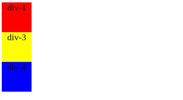
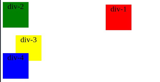
We can’t see div-2 because it is behind div-1.
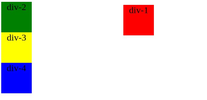
  .div-1 {
      background-color: red;
      position: absolute;
      top: 10px;
      left: 400px;
  }
relativeWe use one use of relative in the upper example and it also has all top, bottom, left, right and z-index properties.
  .div-3 {
      background-color: yellow;
      position: relative;
      top: 30px;
      left: 50px;
  }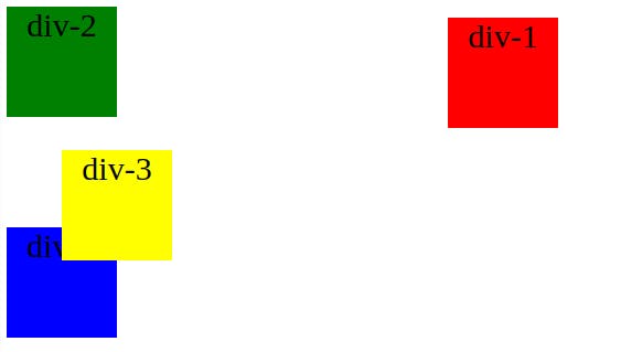
In relative top, bottom, left and right property count from its previous position unlike absolute where it starts from its parents top = 0 and left = 0 position.
If you want div-4 to appear before div-3 then we can use z-index
  .div-4 {
      background-color: blue;
      position: relative;
      z-index: 1;
  }
staticIt is just like relative but it does not have any top, bottom, left, right or z-index properties.
stickythe sticky position is work only with the top property.
<div class="main"> <div class="div-1">div-1</div> <div class="div-2">div-2</div> <div class="div-3">div-3</div> <div class="div-4">div-4</div> </div> <div class="main"> hello!! </div> <div class="main"> hello!! </div>.main{ width: 100%; height: 100vh; position: relative; } .div-4 { background-color: blue; position: sticky; top: 40px; z-index: 1; }Try this code by yourself and observe the div-4 position
fixedThis attribute fixes the element position on the website and while scrolling or its position will not change. In the upper example change the div-4 position to fixed and observe.
Display
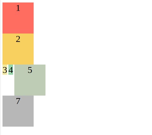
There are so many display property value but mainly there are 6 types block , inline ,inline-block , none , inherit , flex .
<div class="main">
        <div class="div-1">1</div>
        <div class="div-2">2</div>
        <div class="div-3">3</div>
        <div class="div-4">4</div>
        <div class="div-5">5</div>
        <div class="div-6">6</div>
        <div class="div-7">7</div>
</div>
.main{
    width: 100%;
    height: 100vh;
    position: relative;
}
.main > div {
    height: 100px;
    width: 100px;
    text-align: center;
    font-size: 30px;
}
/* default display would be block  */
.div-1 {
    background-color: #FF6D60;
}
/* you can specify display block which take block space took all width, so new element start after that  */
.div-2 {
    background-color: #F7D060;
    display: block;
}
/* it behave just like a text and every inline goes right to that */
.div-3 {
    background-color: #F3E99F;
    display: inline;
}
.div-4 {
    background-color: #98D8AA;
    display: inline;
}
/* it just like block but every elements goes right next to it  */
.div-5 {
    background-color: #BFCCB5;
    display: inline-block;
}
/* you can't see this block  */
.div-6 {
    background-color: #7C96AB;
    display: none;
}
/* it will take its parent property for display  */
.div-7 {
    background-color: #B7B7B7;
    display: inherit;
}
Box Model

Understanding the CSS box model is very important for developers. You can apply this box model to every element of your HTML element. So let's start with the inner part which is the size of your element height x width here height and width are 100. next is padding which is the inner space between your content and the border of your box. Where you can see ‘-’ is a value if not specified that it is ‘-’. Next is a border which specifies the border what is the name suggests. The outer one is the margin which specifics space between your box element and outer space.
So what’s now?
Learning this basic concept of CSS is very important we don’t use this concept to define the whole layout but we use this concept to complete the small task in the development. In the modern day, we are using CSS flex-box and grid for making the whole website layout. Which you can see in Its next part here.
